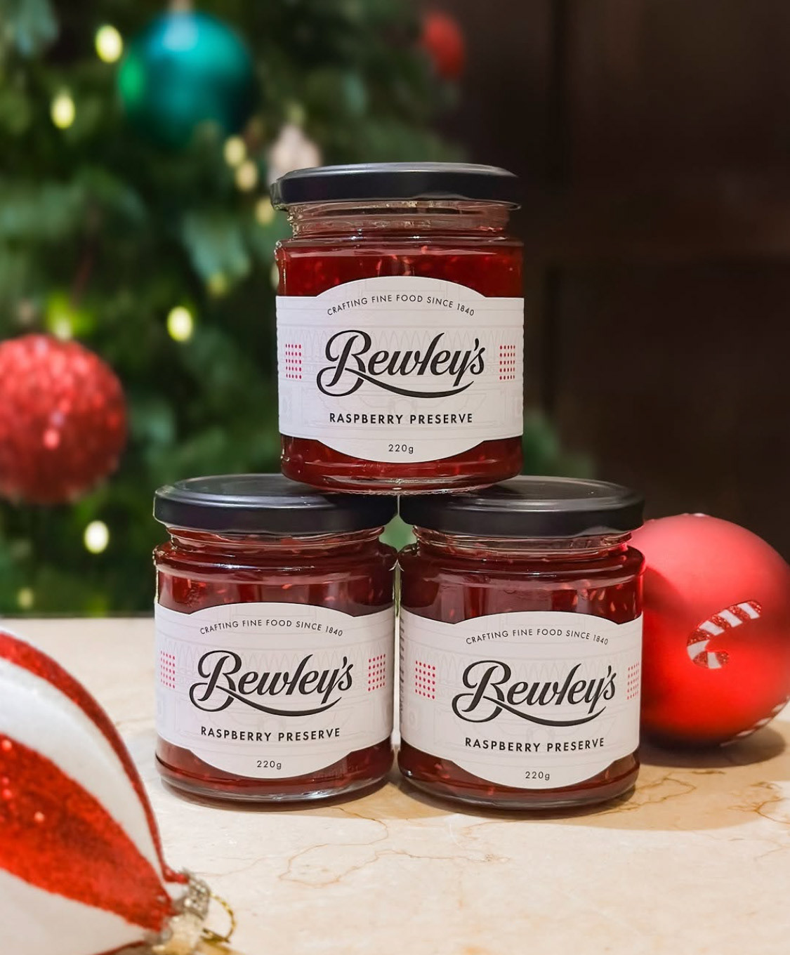
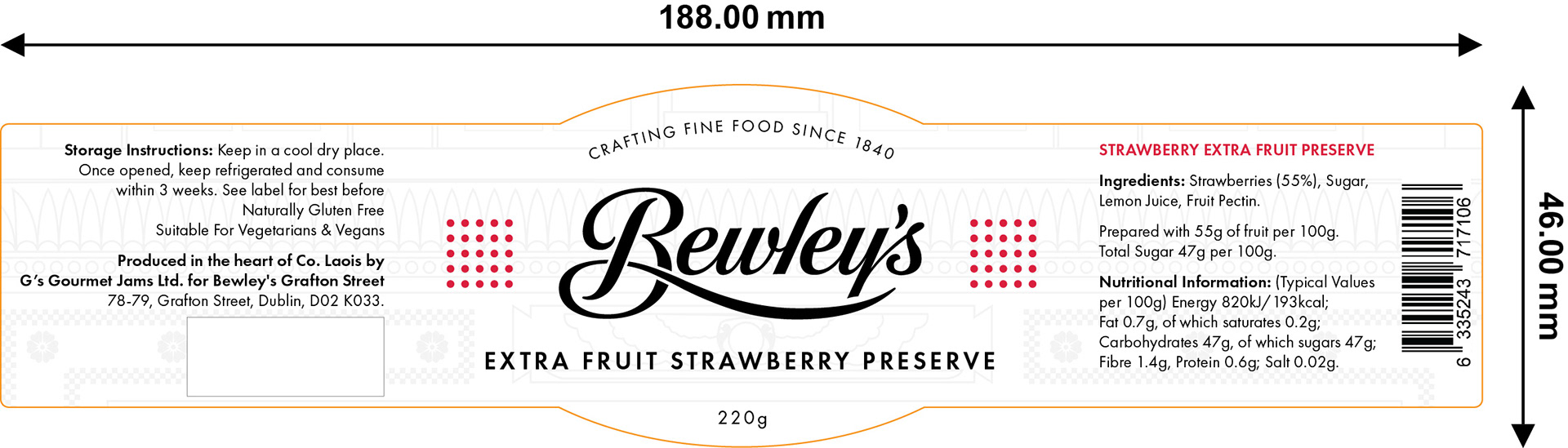
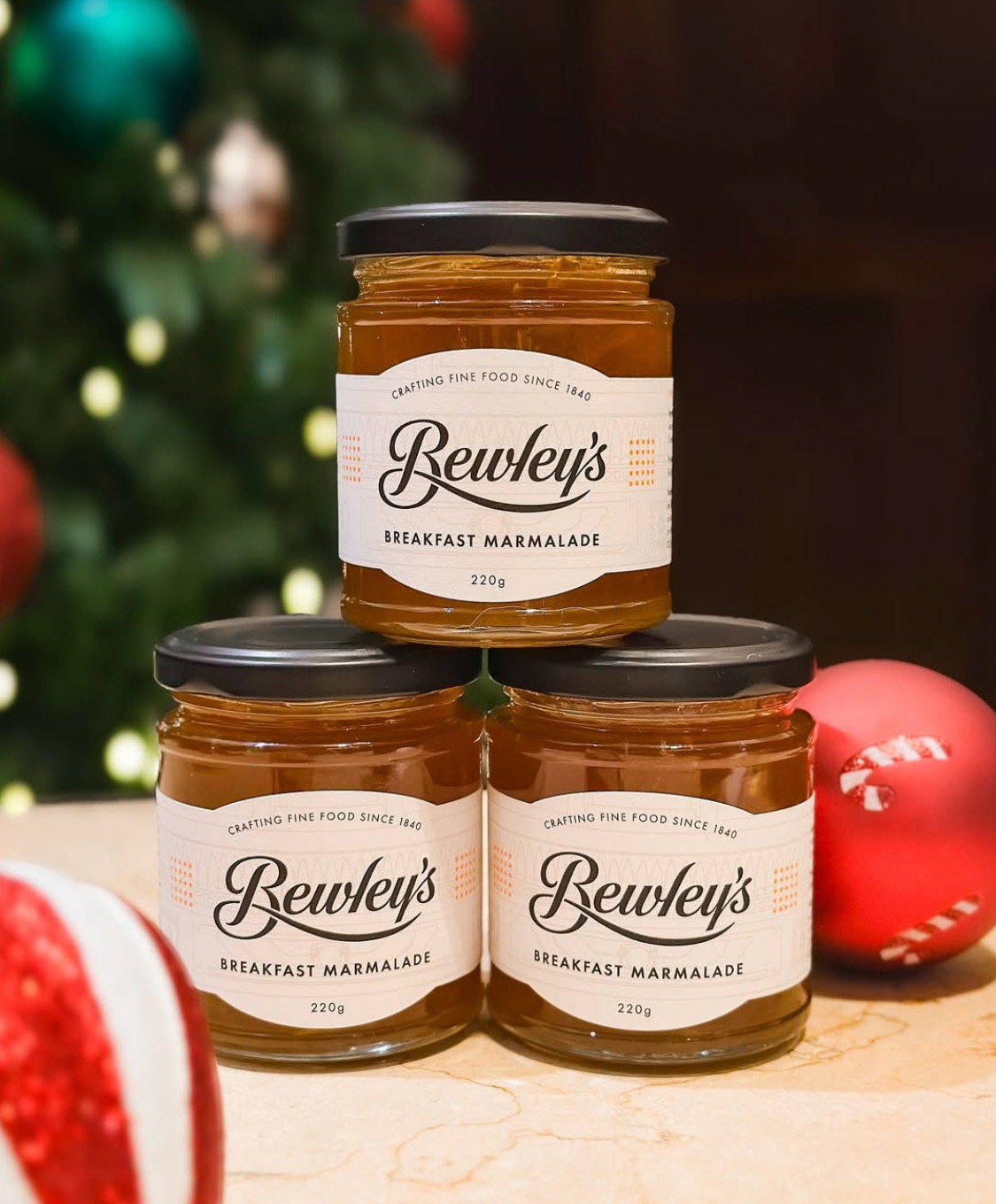
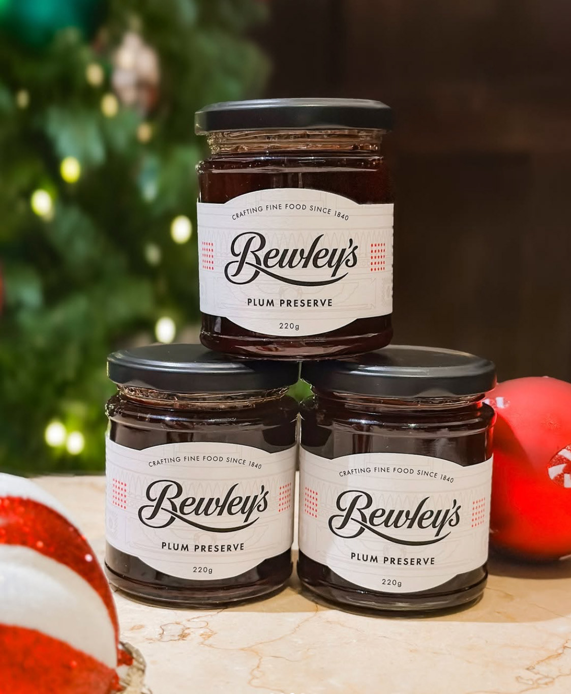
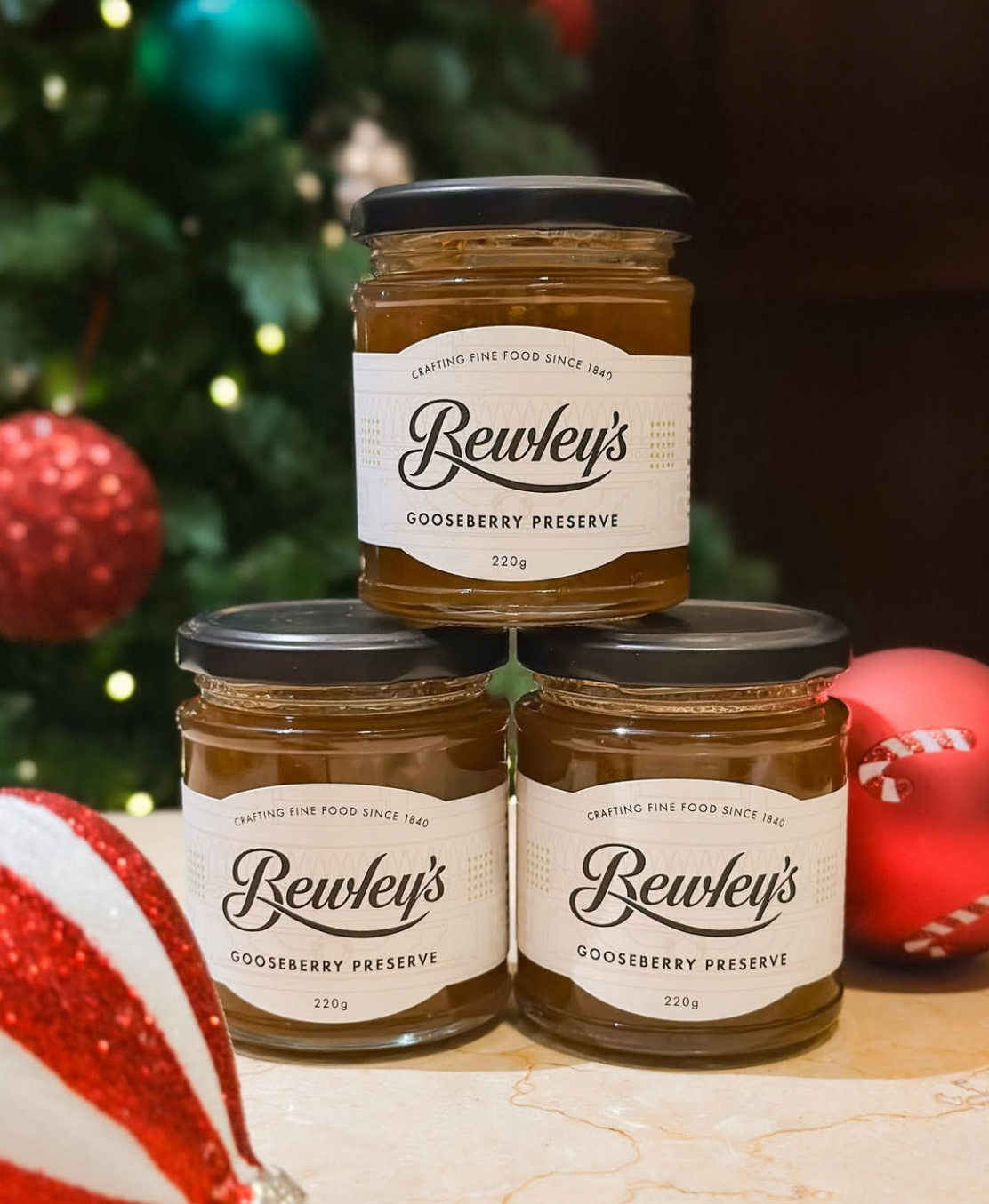
As part of Bewley’s Grafton Street’s retail offering, I was asked to design packaging for a range of five fruit preserves introduced for Christmas 2024. Working within the established brand guidelines, I created a series of jar labels that balanced consistency with character.
To add depth and a sense of place, I incorporated a faded illustration of the iconic Bewley’s façade into the label background. Each flavour was distinguished through the use of the brand’s signature dot grid—applied in a unique colour palette to subtly differentiate the varietals while maintaining overall brand cohesion.